Feature analysis charts
Provides a calculated and plotted set of statistics for the chosen feature.
An example of plotted statistics:
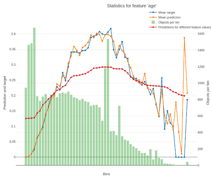
The X-axis of the resulting chart contains values of the feature divided into buckets. For numerical features, the splits between buckets represent conditions (feature < value) from the trees of the model. For categorical features, each bucket stands for a category.
The Y-axis of the resulting chart contains the following graphs:
-
Average target (label) value in the bucket.
-
Average prediction in the bucket.
-
Number of objects in the bucket.
-
Average predictions on varying values of the feature.
To calculate it, the value of the feature is successively changed to fall into every bucket for every input object. The value for a bucket on the graph is calculated as the average for all objects when their feature values are changed to fall into this bucket.
The return value of the function contains the data from these graps.
The following information is used for calculation:
- Trained model
- Dataset
- Label values